Pie and Donut Charts
Pie & Donut
When to use:
- Compare parts of a whole when it is purely a visual representation. This makes Pie charts good for comparisons, such as a split of population by gender. However, as users generally have difficulty with determining visual values in pie graphs, its best to resort to bar charts when more than a few items are to be compared.
- Displays 1 measure over 1 hierarchy
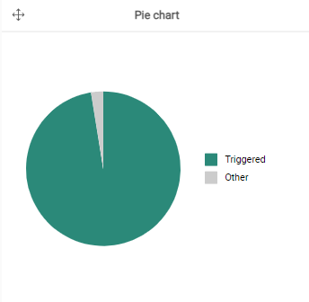
- Smaller values can be categorized under ‘other’
- No ordering
- Used for filtering
But… You should prefer bar/column charts over pie charts because:
- comparing lengths is easier than areas
- Pie charts do not use available space efficiently
- Pie charts force you to (over)use color
- Pie charts always struggle with the small values
